-
[R] 지도 시각화 (미국 주별 강력 범죄율 단계 구분도, 대한민국 시도별 인구, 결핵 환자 수 단계 구분도, 지도 시각화, 구글 차트)프로그래밍/R 2021. 6. 8. 20:17
본 내용은 '2021년 혁신성장 청년인재 집중양성 사업'의 ‘인공지능 개발자 양성 과정’ 강좌를 수강하면서 강의 및 강의노트를 참고하여 작성한 내용입니다.
CH11_지도 시각화
미국 주별 강력 범죄율 단계 구분도, 지도 시각화
11-1-소스
#### 11-1 ####
## 미국 주별 강력 범죄율 단계 구분도, 지도 시각화
데이터셋
    crime : 미국 50개 주 범죄율
    states_map : 미국 주의 위도, 경도


install.packages("maps")
install.packages("ggiraphExtra")
install.packages('mapproj')

library(ggiraphExtra)
str(USArrests)
head(USArrests)

library(tibble)

crime <- rownames_to_column(USArrests, var = "state") # 'state' 열 이름 추가
crime$state <- tolower(crime$state) # 대문자 → 소문자 변환

str(crime)

library(maps)
library(ggplot2)
states_map <- map_data("state")
str(states_map) # long: 위도 / lat: 경도

states_map
crime
ggChoropleth(data = crime,         # 지도에 표현할 데이터
             aes(fill = Murder,    # 색깔로 표현할 변수
                 map_id = state),  # 지역 기준 변수
             map = states_map)     # 지도 데이터

ggChoropleth(data = crime,         # 지도에 표현할 데이터
             aes(fill = Murder,    # 색깔로 표현할 변수
                 map_id = state),  # 지역 기준 변수
             map = states_map,     # 지도 데이터
             interactive = T)      # 인터랙티브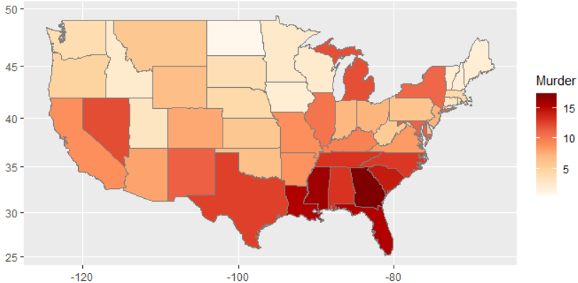

대한민국 시도별 인구, 결핵 환자 수 단계 구분도, 지도 시각화
11-2-소스
#### 11-2 ####
## 대한민국 시도별 인구, 결핵 환자 수 단계 구분도, 지도 시각화
install.packages("stringi")
install.packages("devtools")

devtools::install_github("cardiomoon/kormaps2014")

library(kormaps2014)

str(changeCode(korpop1))

library(dplyr)
korpop1 <- rename(korpop1,
                  pop = 총인구_명,
                  name = 행정구역별_읍면동)
korpop1$name <- iconv(korpop1$name, "UTF-8", "CP949")

str(changeCode(kormap1))

library(ggiraphExtra)
library(ggplot2)

ggChoropleth(data = korpop1,       # 지도에 표현할 데이터
             aes(fill = pop,       # 색깔로 표현할 변수
                 map_id = code,    # 지역 기준 변수
                 tooltip = name),  # 지도 위에 표시할 지역명
             map = kormap1,        # 지도 데이터
             interactive = T)        # 인터랙티브

## -------------------------------------------------------------------- ##
str(changeCode(tbc))

tbc$name1 <- iconv(tbc$name1, "UTF-8", "CP949") # 인코딩 변환(UTF-8 → CP249)

ggChoropleth(data = tbc,           # 지도에 표현할 데이터
             aes(fill = NewPts,    # 색깔로 표현할 변수
                 map_id = code,    # 지역 기준 변수
                 tooltip = name),  # 지도 위에 표시할 지역명
             map = kormap1,        # 지도 데이터
             interactive = T)      # 인터랙티브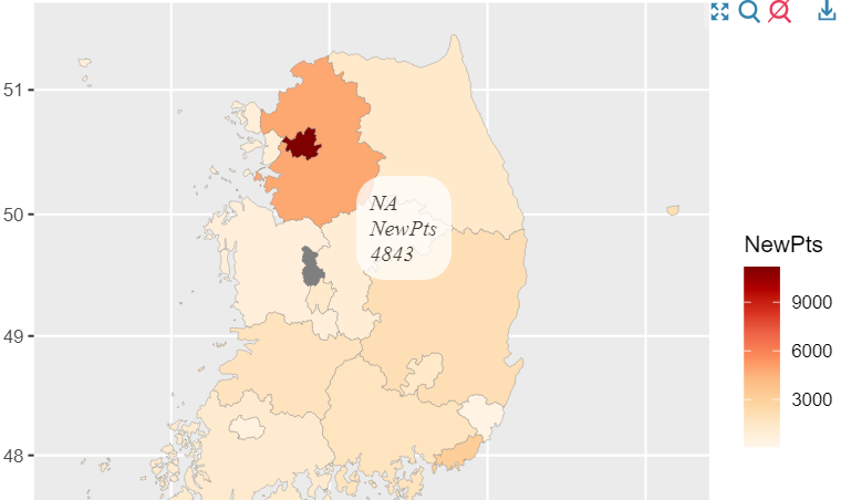

구글 차트 csv 연동
- javascript로 작성됨
- 패키지 설치하면 모든 구글차트를 사용할 수 있다
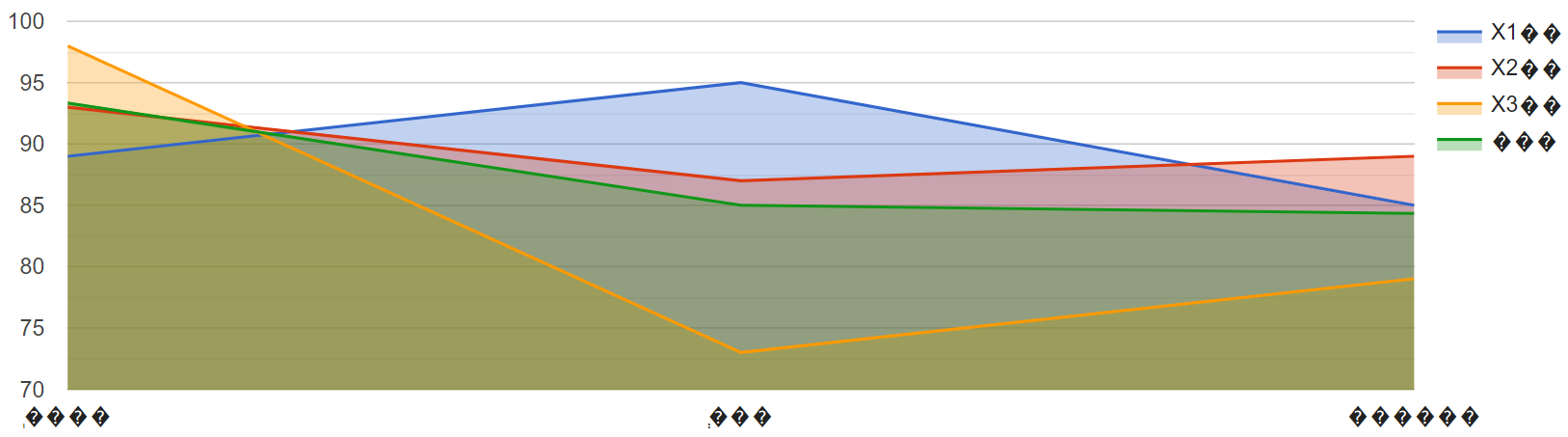
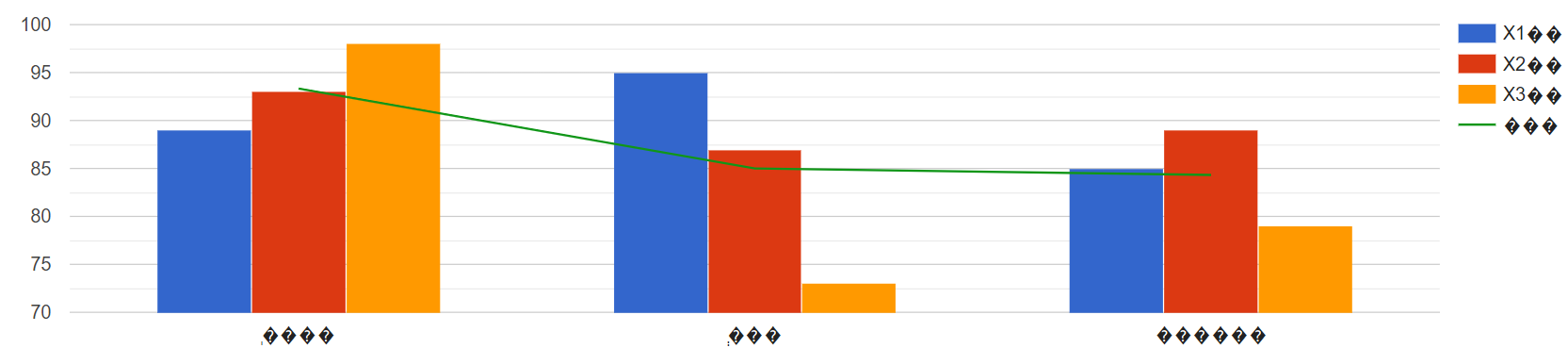
#### 구글 차트 ####

#예제 구글 열 차트
install.packages("googleVis")
library(googleVis)

korean <- read.csv("학생별회차별성적__국어_new.csv",header=T)
korean
class(korean)
str(korean)
kor <- gvisColumnChart(korean,options=list(title="학생별 성적비교",
                                           height=400,weight=500))
plot(kor)
#한글 깨지면 오른쪽 마우스 --> 인코딩 --> 한국어

#예제 구글 AreaChart
library(googleVis)
korean <- read.csv("학생별회차별성적__국어_new.csv",header=T)
korean

area <- gvisAreaChart(korean,options=list(height=400,weight=500 ))
plot(area)

#예제 구글 ComboChart
library(googleVis)
korean <- read.csv("학생별회차별성적__국어_new.csv",header=T)
korean

combo <- gvisComboChart(korean,options=list(seriesType="bars",
                                            height=400,weight=500,series='{3: {type:"line"}}'))

plot(combo)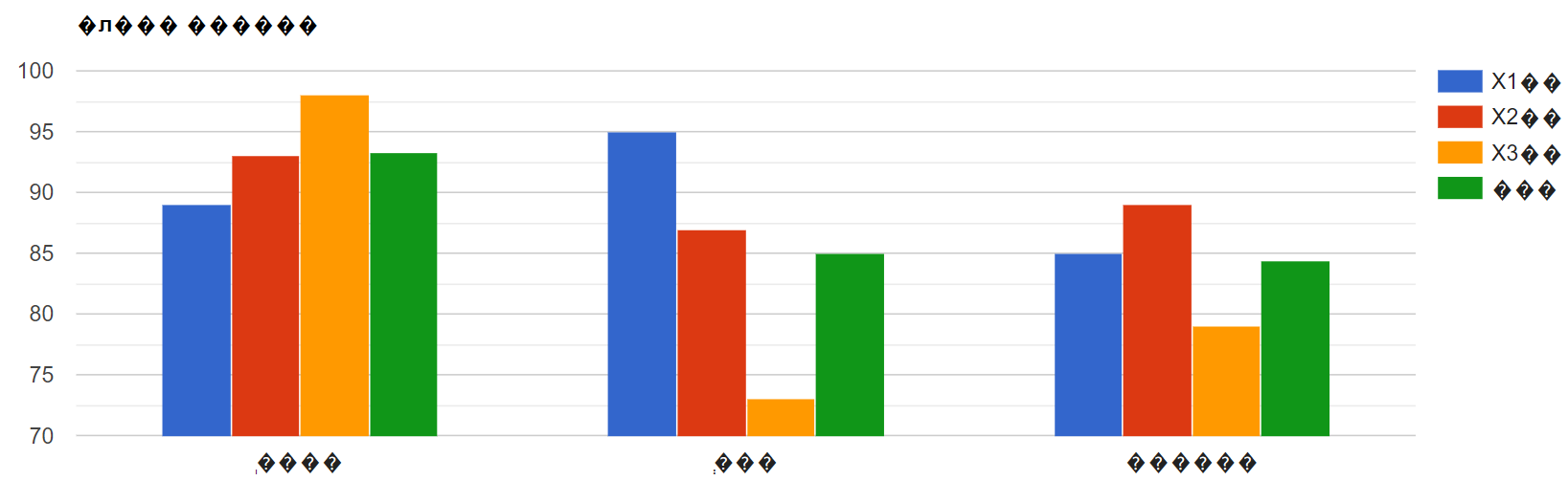
인터랙티브 그래프 만들기 (plotly 패키지, 유료) p.290
#### 인터랙티브 그래프 만들기 p.290 ####
# 데이서셋 mpg, diamonds : ggplot2 패키지의 내장 데이터셋
install.packages("plotly")
library(plotly)
library(ggplot2)

ggplot2::diamonds # 데이서셋 직접 접근

# 인터랙티브 그래프 만들기
p <- ggplot(data = mpg, aes(x = displ, y = hwy, col = drv)) +
    geom_point() # 산점도 그래프
ggplotly(p)

# 인터랙티브 막대 그래프 만들기
p <- ggplot(data = diamonds, aes(x = cut, fill = clarity)) +
  geom_bar(position = "dodge") # 선그래프
ggplotly(p)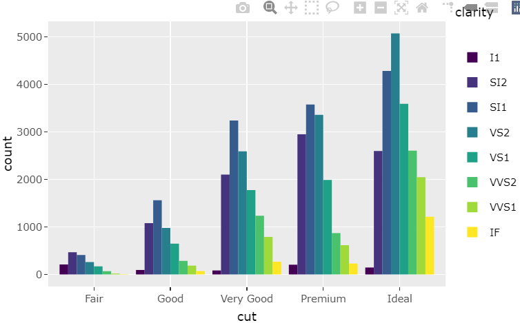
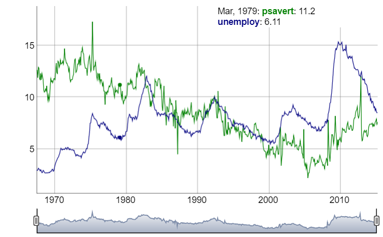
인터랙티브 시계열 그래프 만들기 (dygraphs 패키지) p.293
install.packages("dygraphs")
# remove.packages("dygraphs") # 패키지 삭제

library(dygraphs)
library(ggplot2)

ggplot2::economics # 데이터셋 접근

economics <- ggplot2::economics
head(economics)
library(xts)
eco <- xts(economics$unemploy, order.by = economics$date)
head(eco)

dygraph(eco) #그래프 그리기

# 날짜 범위 선택 가능
dygraph(eco) %>% dyRangeSelector()

# 저축률
eco_a <- xts(economics$psavert, order.by = economics$date)

# 실업자 수
eco_b <- xts(economics$unemploy/1000, order.by = economics$date)

# 데이터 결합
eco2 <- cbind(eco_a, eco_b)

# 변수명 바꾸기
colnames(eco2) <- c("psavert", "unemploy")

head(eco2)

#그래프 그리기
dygraph(eco2) %>% dyRangeSelector()
구글 게이지, 도넛, 파이 차트 실습
- f12 개발자 도구에서 html 파일로 만들 수 있다!
Visualization: Pie Chart | Charts | Google Developers
#구글 게이지 차트 (자동차 계기판)

setwd("d:\\")
getwd()
library(googleVis)
CityPopularity
class(CityPopularity)
str(CityPopularity)
ex1 <-gvisGauge(CityPopularity, options=list(min=0, max=800,
                                             greenFrom=500, greenTo=800,
                                             yellowFrom=300, yellowTo=500,
                                             redFrom=0, redTo=300, width=800, height=600))
plot(ex1)

#구글 파이 차트
CityPopularity
class(CityPopularity)
str(CityPopularity)

# html이 출력된다
pie1 <- gvisPieChart(CityPopularity,options=list(width=800, height=600))
plot(pie1)

# 도넛 차트 만들기
# 슬라이스는 가장 처음에 0 부터 오른쪽으로 증가
pie2 <- gvisPieChart(CityPopularity, options=list(
  slices="{4: {offset: '0.2'}, 0: {offset: '0.3'}}",
  title="City popularity",
  pieSliceText="label",
  pieHole="0.5",width=800, height=600))
plot(pie2)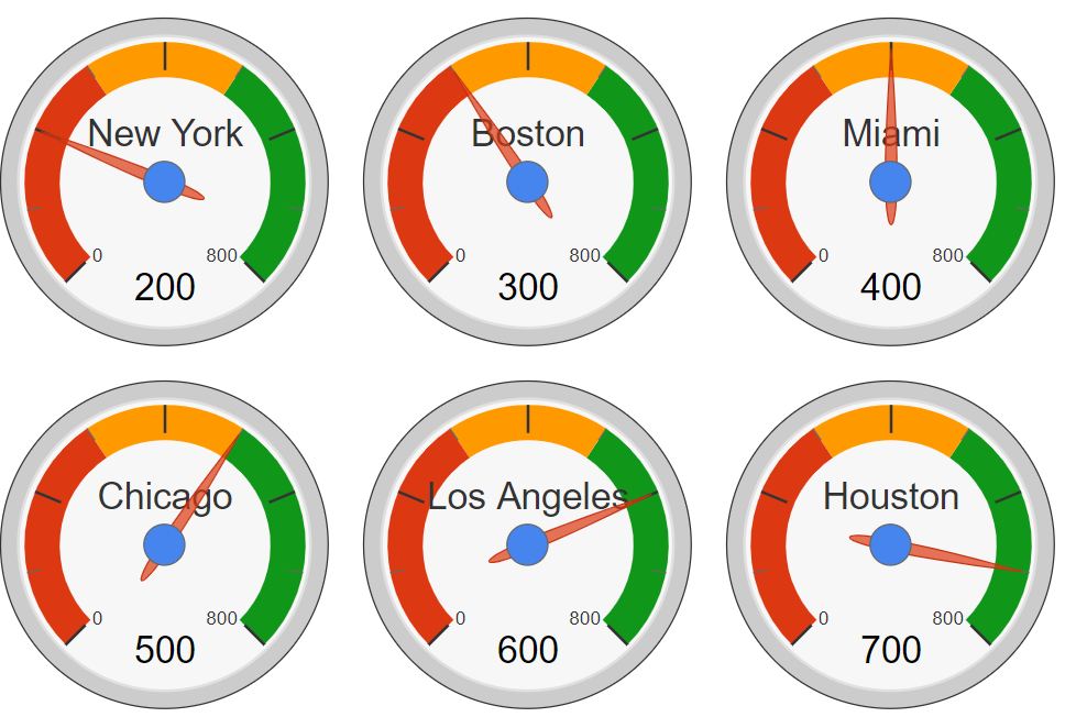
구글 게이지 차트 (자동차 계기판)
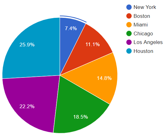

구글 파이 차트 (gvisPieChart) / 도넛 차트 (gvisPieChart)
'프로그래밍 > R' 카테고리의 다른 글
교재 정리, 요약 (0) 2021.06.10 [R] 상관분석, 그래프 그리기(히트맵) (0) 2021.06.09 [R] 텍스트 마이닝 (웹 특정 페이지 읽어오기 (0) 2021.06.08 [R] wordcloud2 패키지 실습 (0) 2021.06.07 [RStudio, 스크랩] Error-.onLoad가 loadNamespace()에서 'rJava'때문에 실패했습니다 (0) 2021.06.06